0101

Trulieve

the projectthe project

Onward

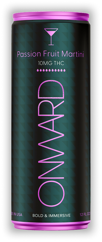
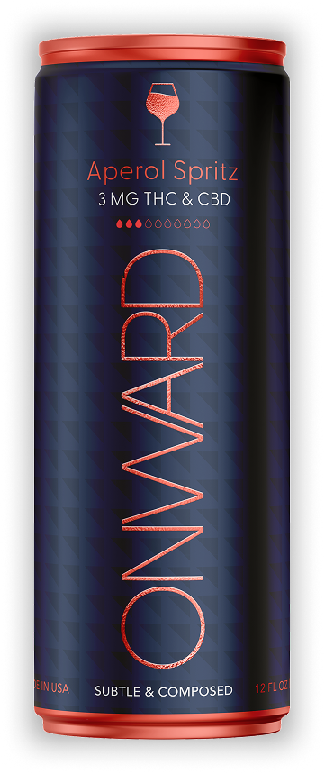
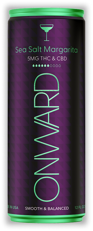
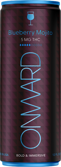
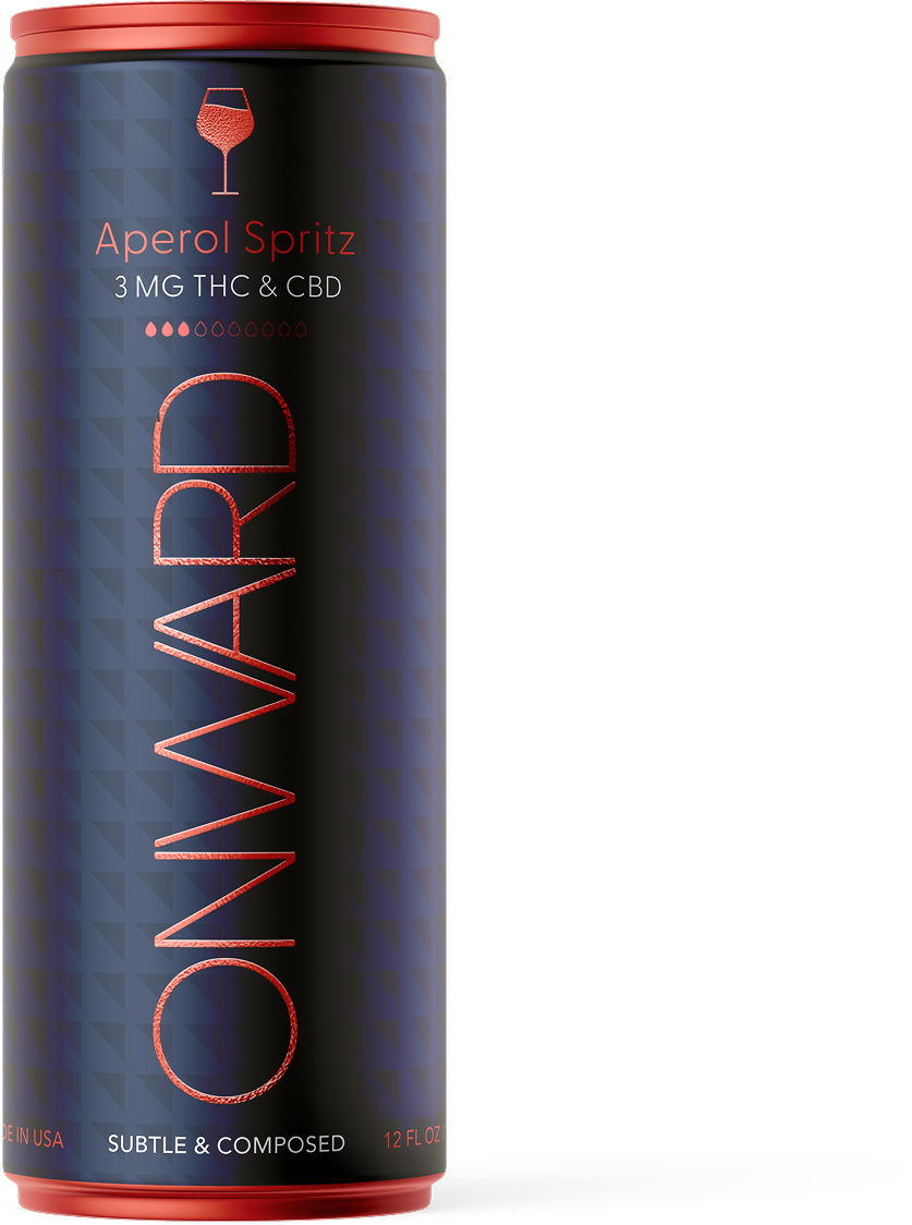
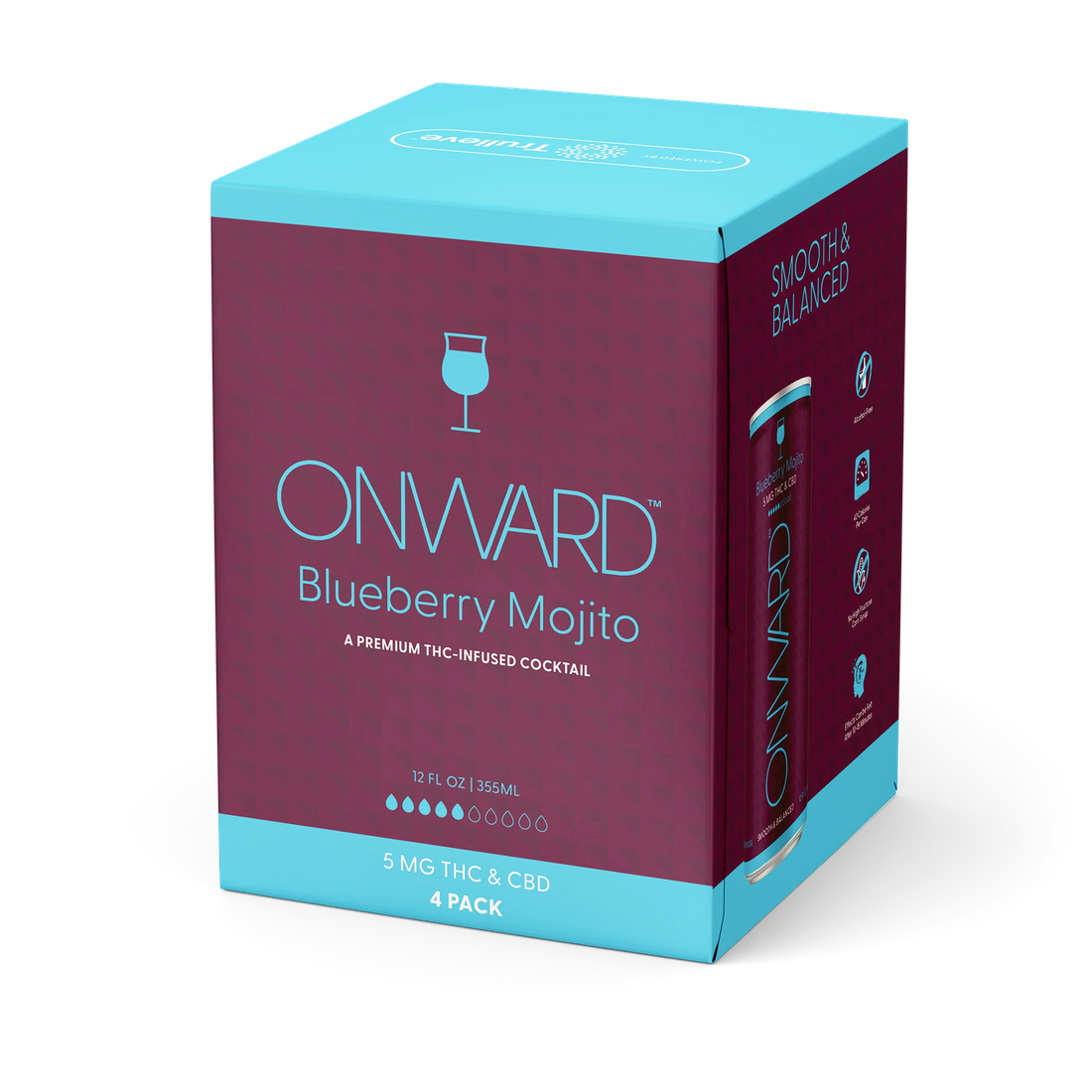
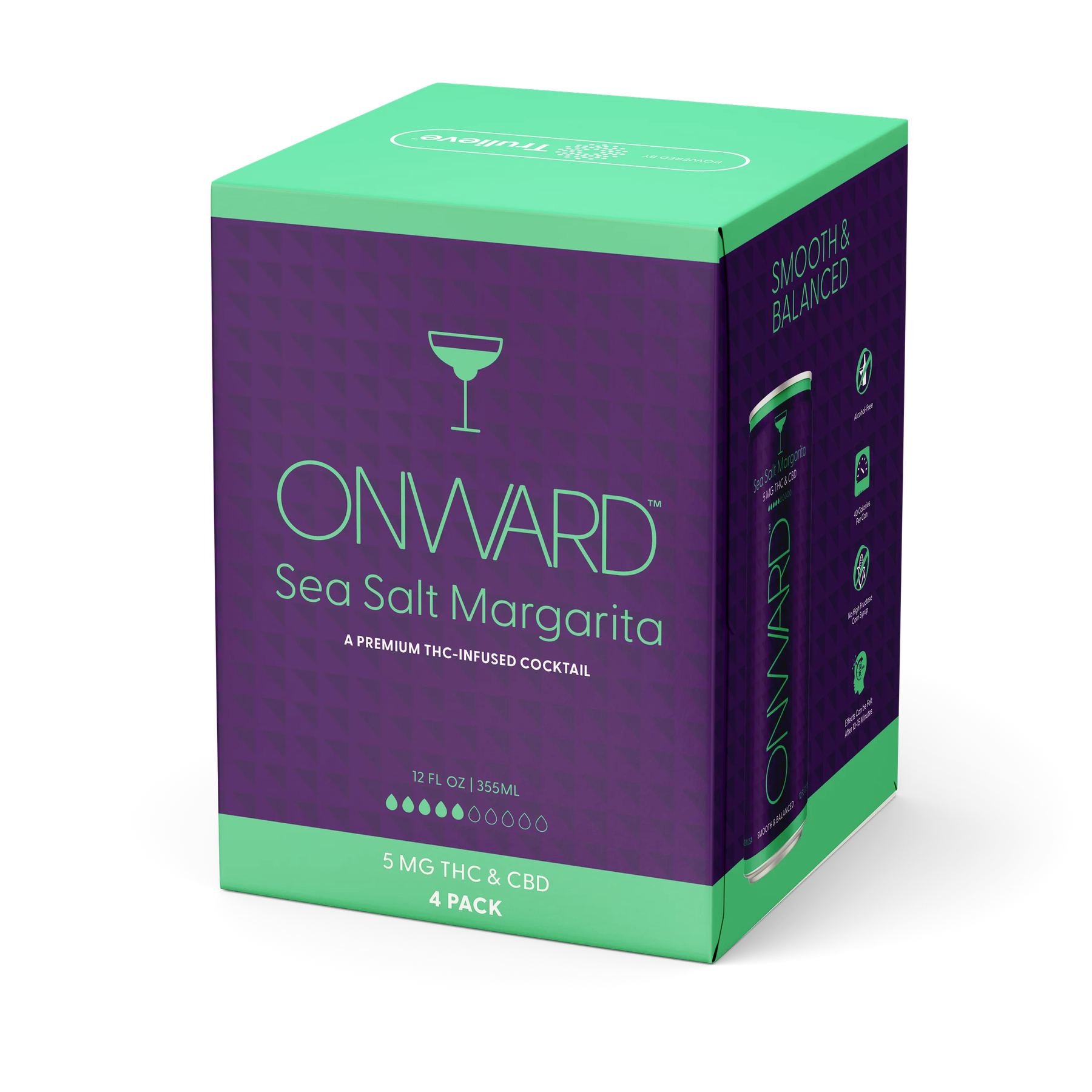
Editorial Elegance — We were tasked with creating the brand identity, logo, and packaging system for Onward, a collection of low-calorie, THC-infused classic cocktails.

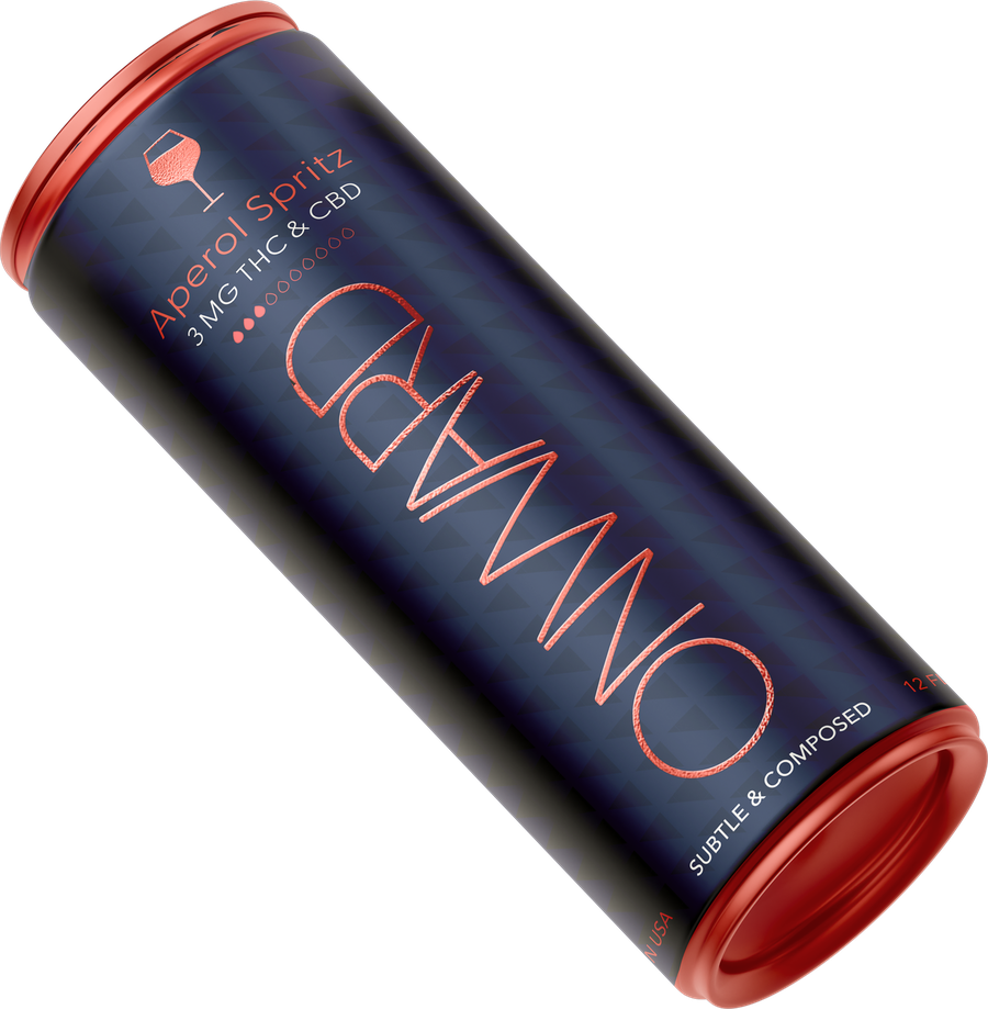
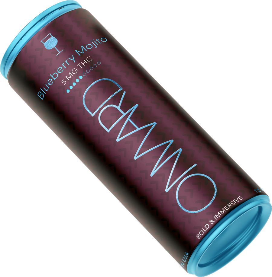
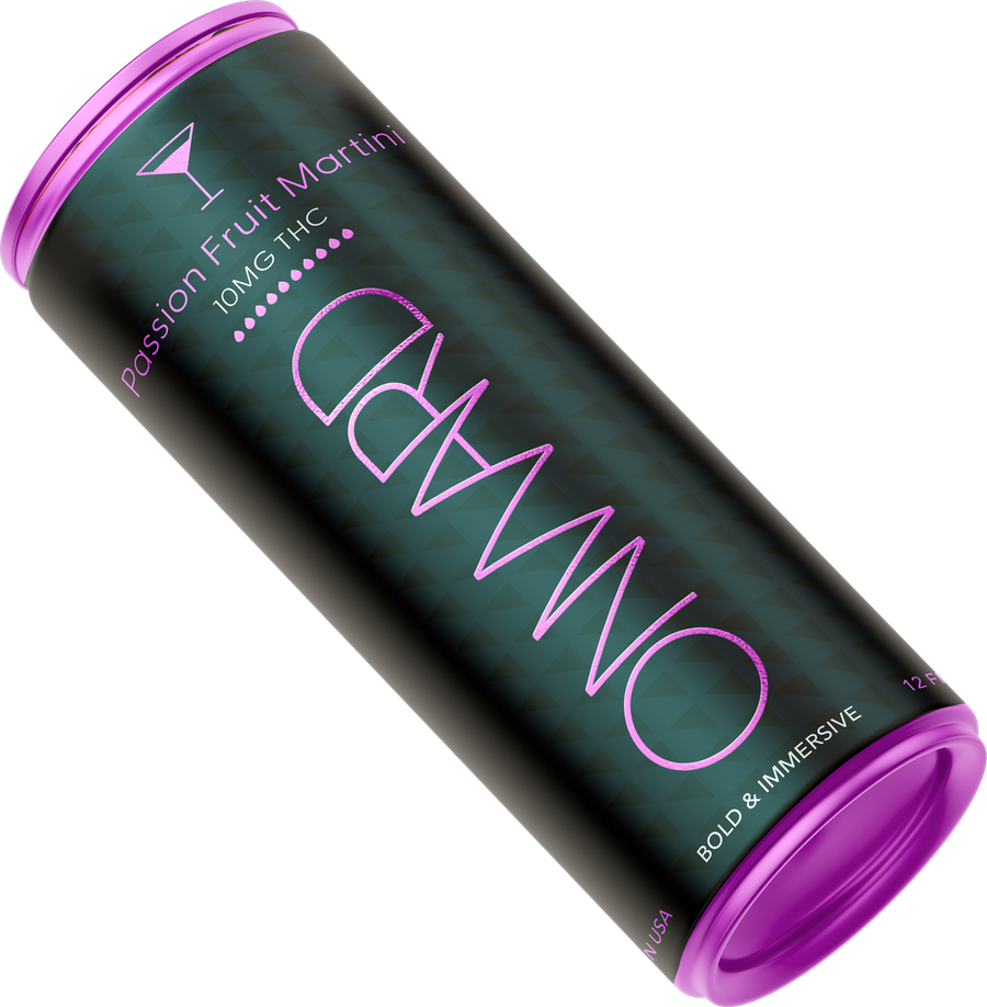
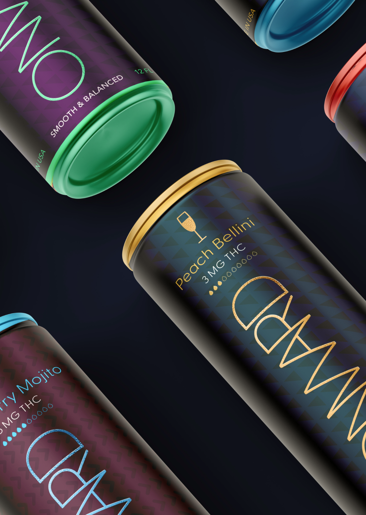
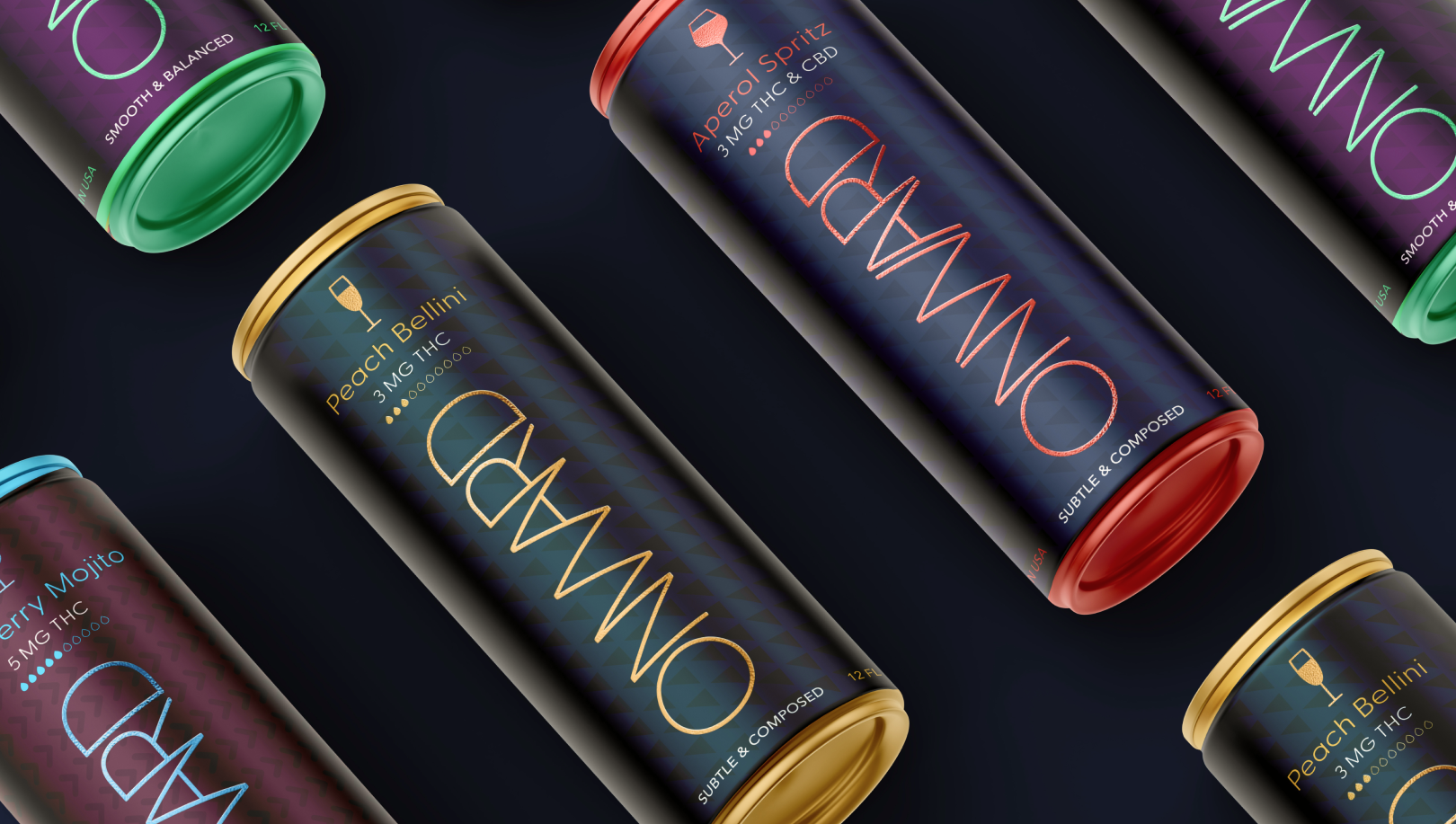
This sophisticated black-and-white direction uses bold typography and the MG THC number as the primary visual statement, creating strong shelf presence. Distinct color coding brings vibrancy and personality to each flavor while maintaining a clean, modern, and refined system.

Onward is a family of low-calorie, THC-infused drinks made with all-natural ingredients, designed to deliver a happy experience and elevated state of mind.

ROLE: Logo, Branding, Packaging Design, Art Direction, System Design Produced for: Trulieve
The color palette balances elegance and contrast, pairing textured background colors with vibrant accents to highlight key information and bring the flavor design system to life. Backgrounds, textures, typography, and icons work together in a natural yet modern and sophisticated way.

  • RGB: #26344f

    CMYK: 90, 78, 44, 39

  • RGB: #54293f

    CMYK: 55, 84, 50, 46

  • RGB: #3e0645

    CMYK: 76, 100, 34, 46

  • RGB: #083e41

    CMYK: 91, 57, 60, 48

  • RGB: #013141

    CMYK: 96, 70, 52, 51

  • RGB: #000000

    CMYK: N/A

  • RGB: #e35545

    CMYK: 6, 82, 77, 0

  • RGB: #00d1fe

    CMYK: 62, 0, 1, 0

  • RGB: #2ce892

    CMYK: 61, 0, 64, 0

  • RGB: #f37efa

    CMYK: 18, 54, 0, 0

  • RGB: #e8b22c

    CMYK: 9, 30, 96, 0

  • RGB: #F6F6F6

    CMYK: N/A

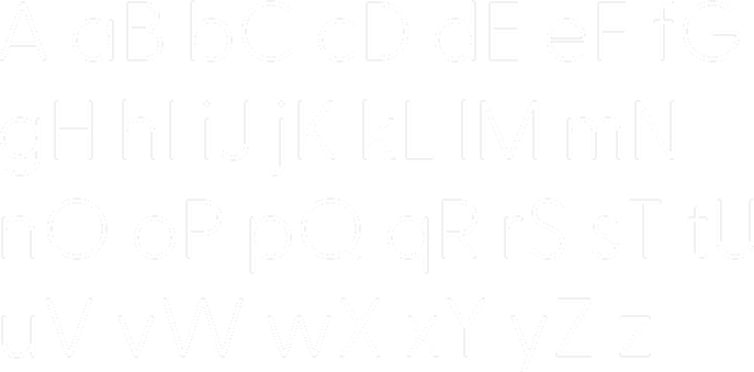
Primary fontGreycliff CF
Greycliff CF preview
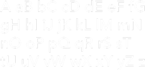
Secondary fontAvenir
Avenir preview

One brand.Five distinct flavors.

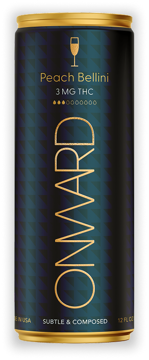
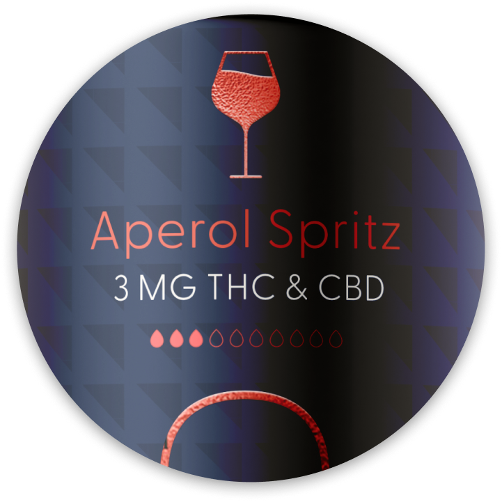
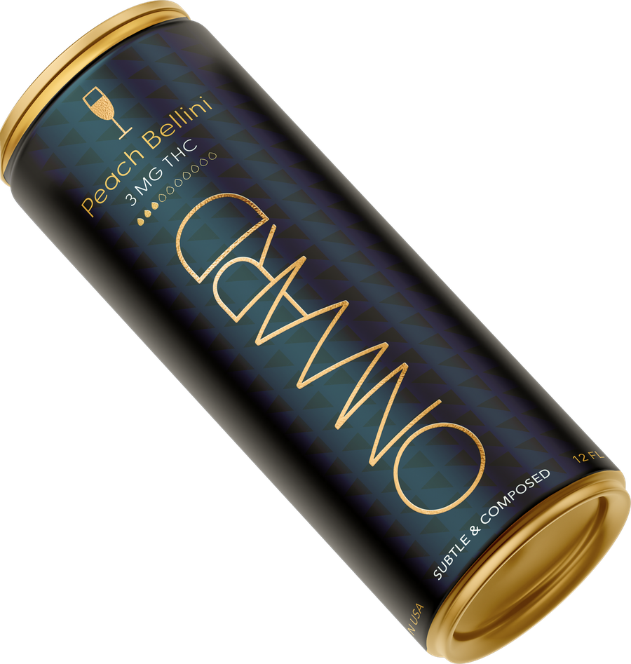
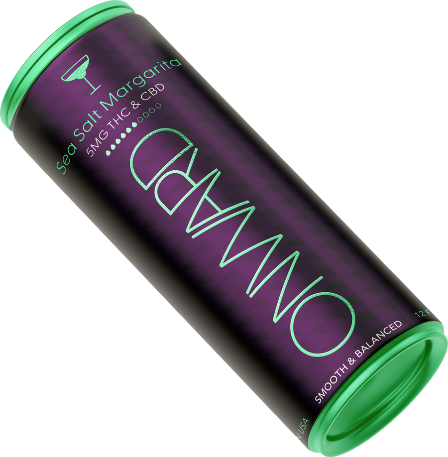
The packaging system balances consistency with individuality, weaving together flavor-inspired colors, cocktail- inspired iconography, and clear dosage information. Each flavor tells its own story through a distinct visual identity, while a cohesive design language brings the collection together as one harmonious family.

  • Each cocktail takes shape through a signature silhouette—an expressive visual cue for every flavor.

  • Muted sophistication meets a vibrant pop—each pairing capturing the spirit of the cocktail.

  • A droplet icon system intuitively signals the THC strength of each drink.

Raised metallic typography emerges from a rich, textured pattern, creating depth you can see and a tactile sensation you can feel.

Vibrant yet refined, the interplay of light, texture, and color gives the can a luxurious presence—designed to catch the eye, invite the touch, and feel just as good in your hand as it looks at the party.

FROM IDENTITYTO SHELF.

Extruded metallic typography rises from a rich, textured pattern, creating a tactile sense of depth and dimension. Vibrant yet refined, the interplay of light, texture, and color gives the can an elevated, luxurious presence.

services

  • Art Direction
  • Product design & CPGs
  • Presentation design.
  • Social Campaign
  • Retouching
  • Print & Merchandise
  • Perfecting your typography
  • Branding.
  • Packaging design.
  • Storyboarding.
  • Daydreaming.