0101

Spotify

the projectthe project

Noteable

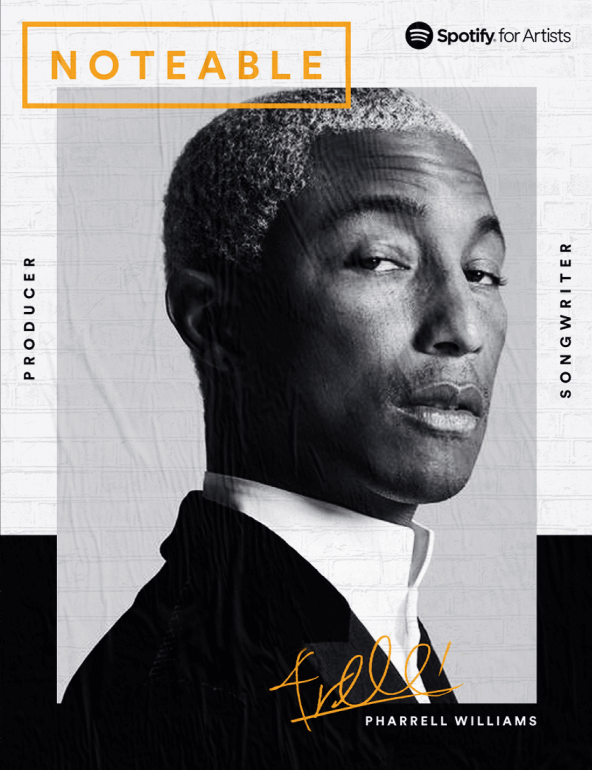
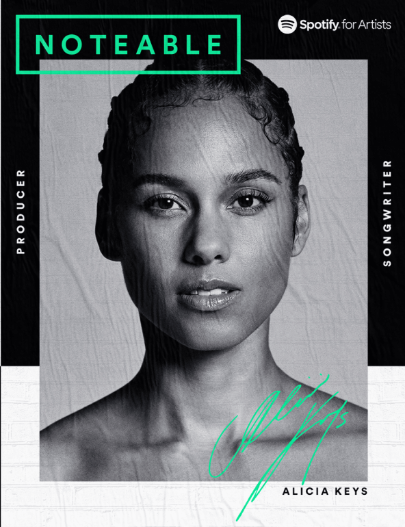
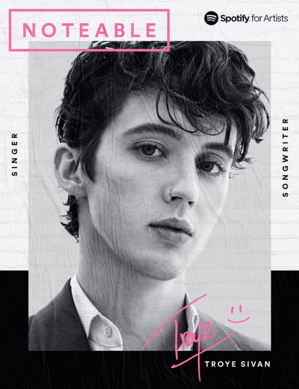
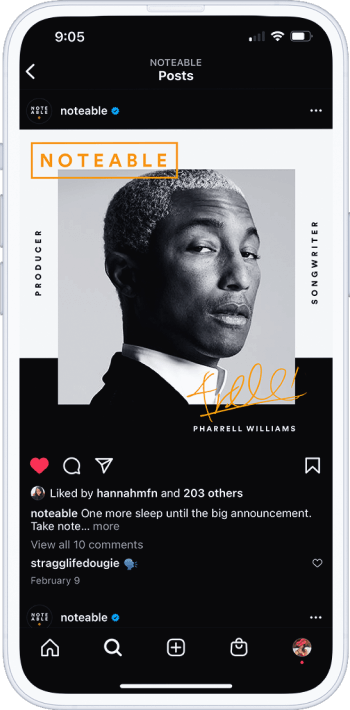
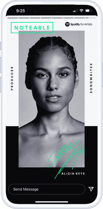
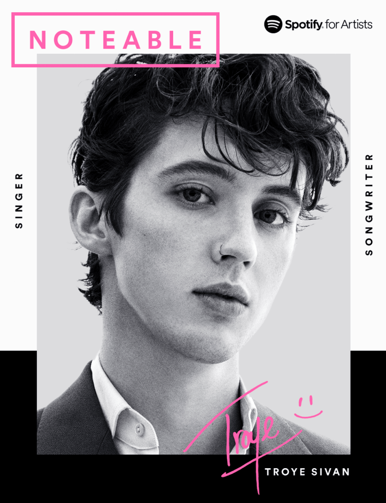
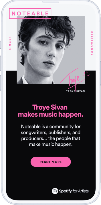
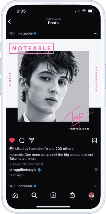
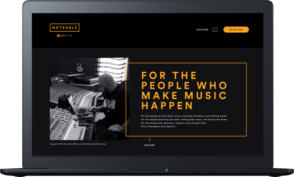
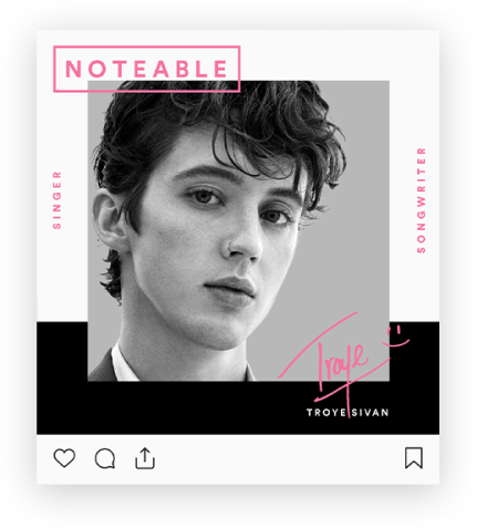
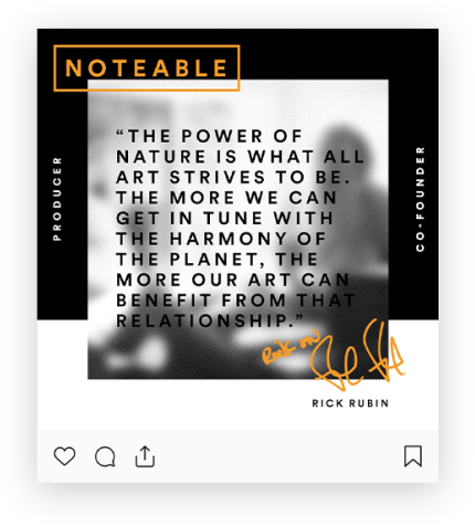
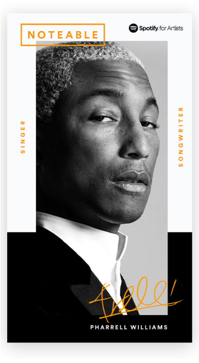
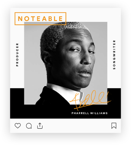
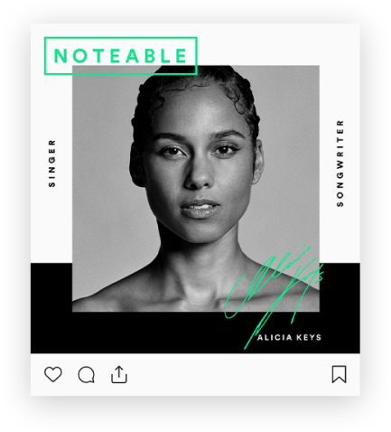
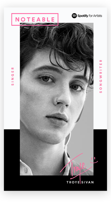
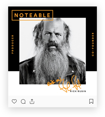
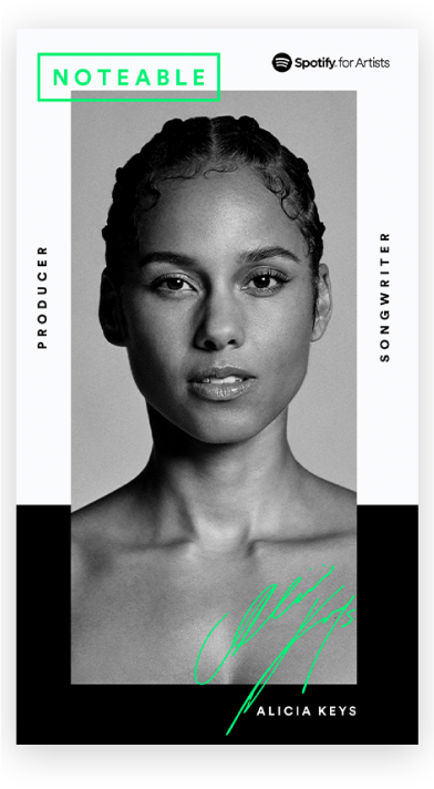
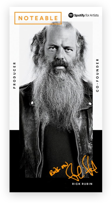
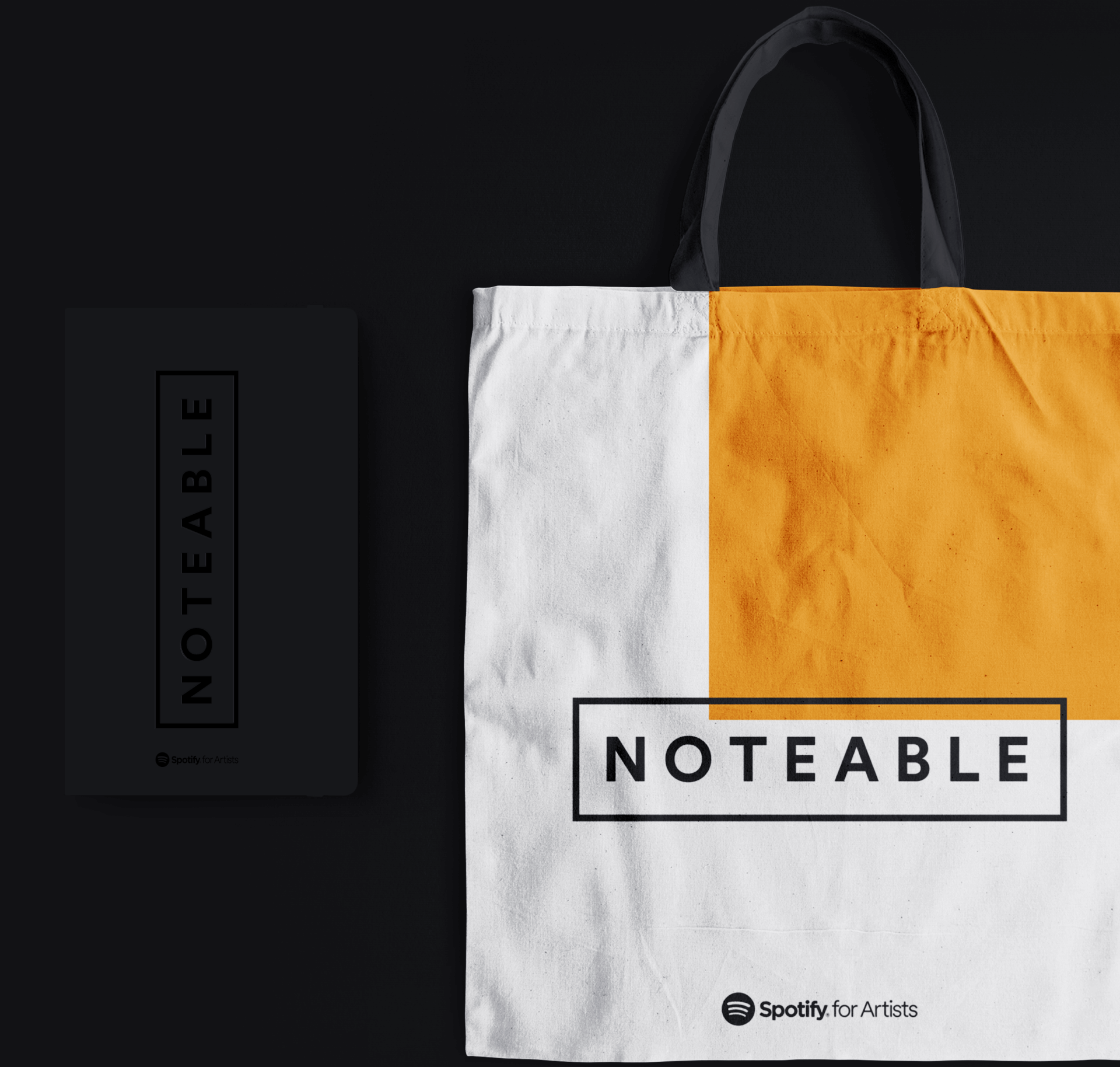
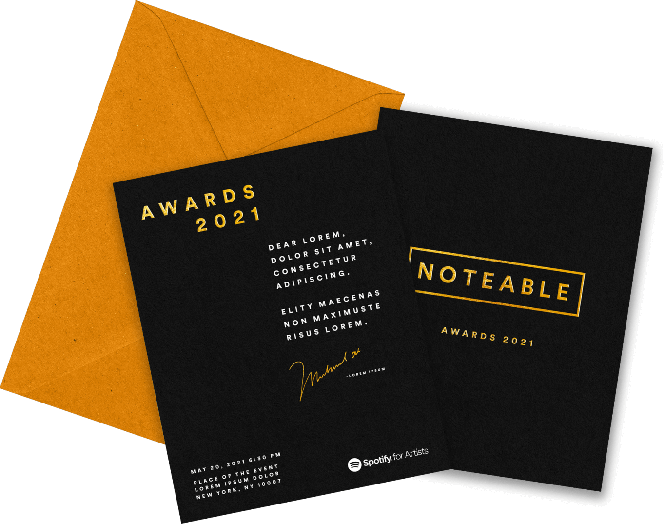
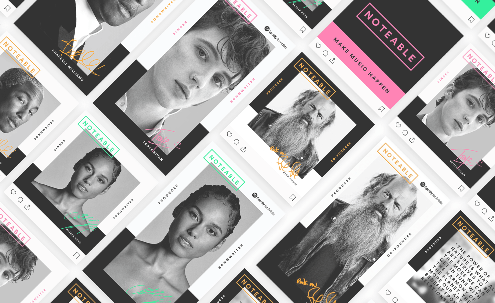
Our team was tasked with creating a look and feel and branding that could be scalebale and serve as an umbrella for Noteable, behind the mic and other services. We brought the brief to life by creating an art direction that places the behind-the-scenes publishers, songwriters, and producers in the spotlight. To achieve this, we used black and white photography and a very limited color palette, and original, handwriten signatures to show how importand those contributors are in the music and creator industry.

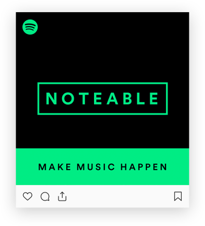
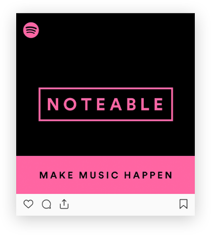
Noteable is a community of education, inspiration and collaboration for songwriters, publishers and producers.

ROLE: Art Direction, Branding, Design, Social Media, Merch, OOH Collateral
Produced for: Spotify
CLIENT: Spotify

Nateable's logo design was inspired by the essence of music - the note sheet. We conceptualized the idea of a simple line coming from a note sheet and wrapping it around the logo, creating a unique and recognizable visual identity. To achieve a modern and bold effect, we used Spotify Circular Bold font for the lockup, which was loosely kerned to create a balanced and harmonious composition. This logo not only reflects the music industry but also conveys the community aspect of Nateable, bringing together songwriters, publishers, and producers in a collaborative space.

  • BLACK

    #191414

    C: 0 M: 0 Y: 0 K: 100

  • WHITE

    #191414

    C: 0 M: 0 Y: 0 K: 100

  • AZURE

    #59A0F6

    C85 M21 Y0 K0

  • SALMON

    F573A0

    C0 M50 Y4 K0

  • GOLD

    F59B23

    C0 M41 Y100 K0

  • ELECTRIC SEAFOAM

    19E68C

    CMYK N/A

By strategically selecting colors that complement the overall aesthetic of the photograph, the mid-tones can help create depth and visual interest, without overpowering the primary focus of the image. Whether used to emphasize a product or add depth to a scene, the right mid-tone colors can bring a photo to life and elevate its impact on the viewer.

/static/slider1-1-e3a1eed33e4dc1b53e0a66f4fa0f9188.png
/static/slider1-2-a1ae015b0ebebd3074e9cfd3d9fb804c.png
/static/slider1-3-b94bb23a473d92057dc39acc29b15578.png

The branding was extended beyond just the logo and art direction to various mediums including OOH, social media, video, animation, and events. For OOH, we utilized large billboards, wild postings and bus stop ads featuring our behind the scenes artists. We utilezed hero portraits, behind the scenes shots and quotes to tell a full story of creation of music and sound.

On social media, we designed templates for promotional posts and stories that used the same visual elements and color scheme, creating a cohesive and recognizable brand presence across all platforms. Additionally, we created a promotional video and animated graphics that incorporated the branding elements, further reinforcing the brand identity. Finally, we ensured that the branding was consistent throughout the event by incorporating the same design elements in the event signage, merchandise, and promotional materials. This approach ensured that the brand message was effectively communicated to the target audience across multiple touchpoints.

services

  • Art Direction
  • Product design & CPGs
  • Presentation design.
  • Social Campaign
  • Retouching
  • Print & Merchandise
  • Perfecting your typography
  • Branding.
  • Packaging design.
  • Storyboarding.
  • Daydreaming.