
0101

All House

the projectthe project

RealEstateApp

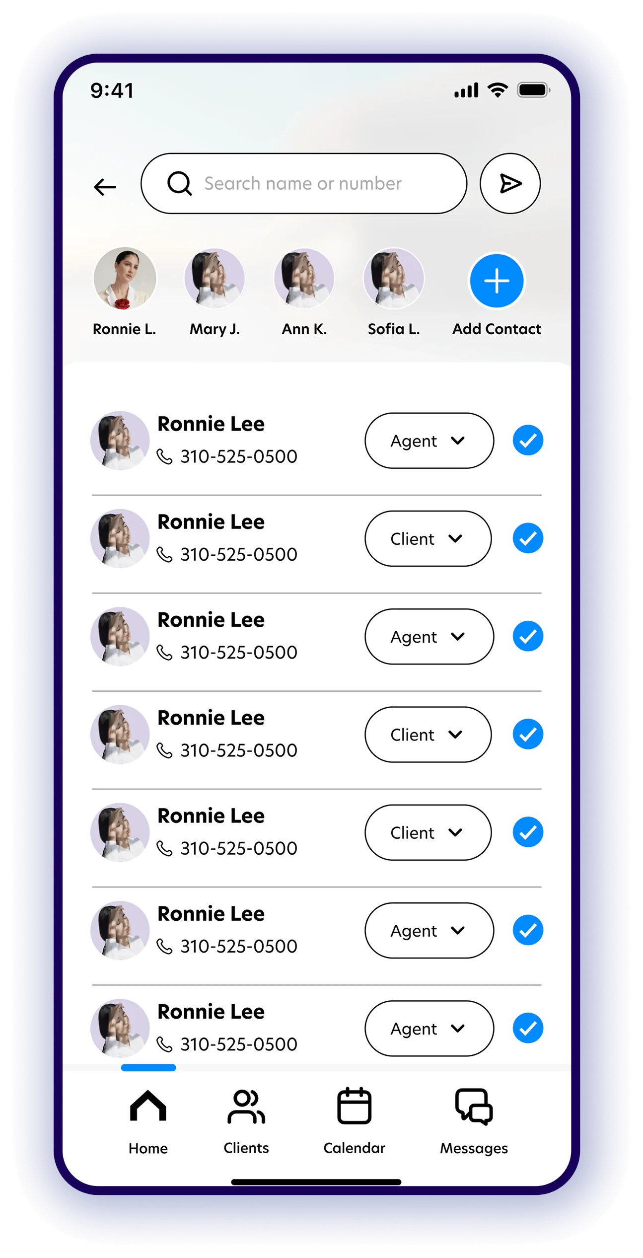
Buying a home means pre-approvals, home searches, offers, negotiations, inspections, funding and a long run of signatures. Each step has its own people and its own channel: emails, faxes, phone calls and a separate portal for every vendor. Buyers lose sight of what comes next, and agents spend their days relaying updates.

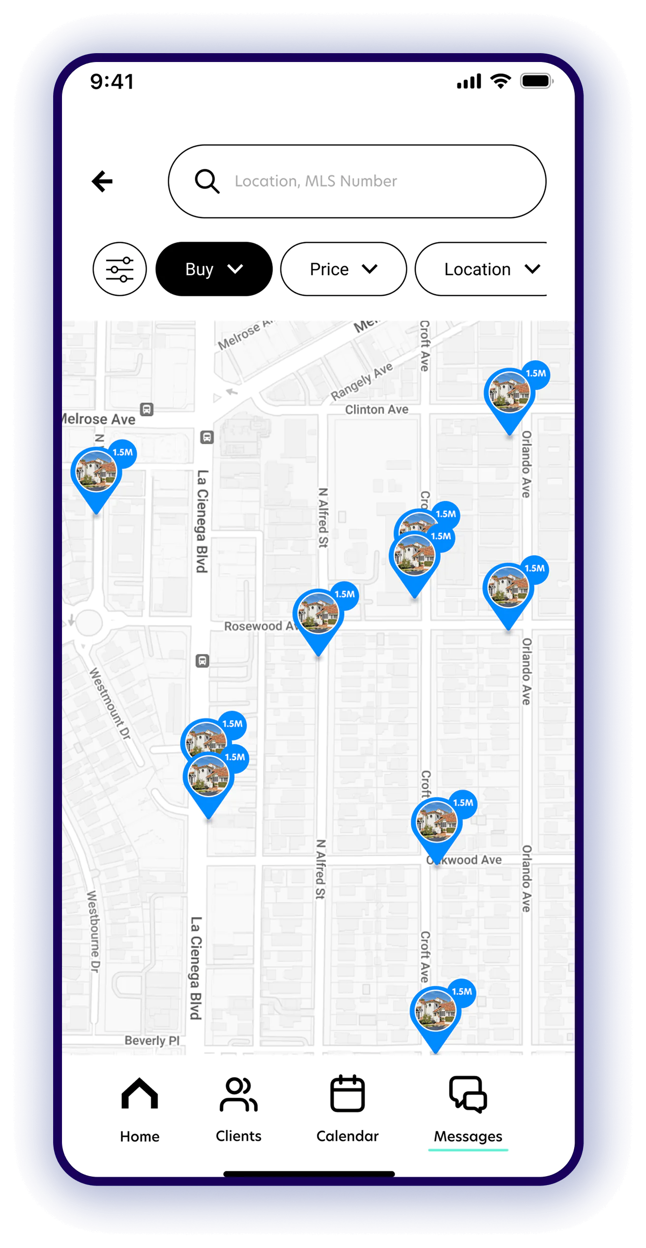
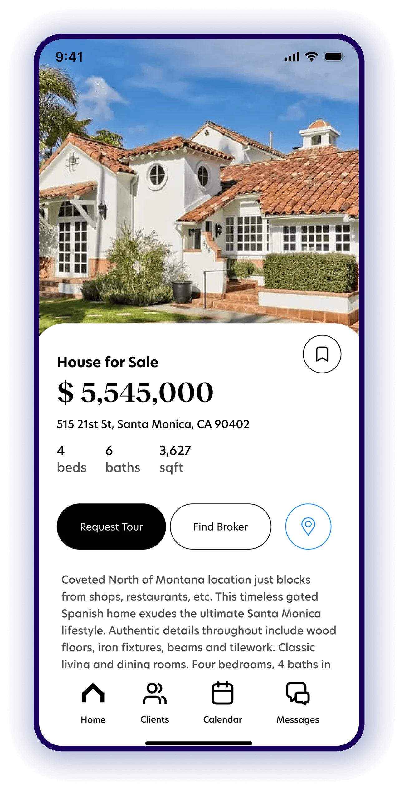
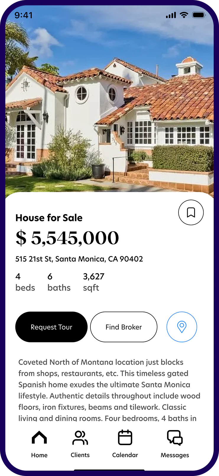
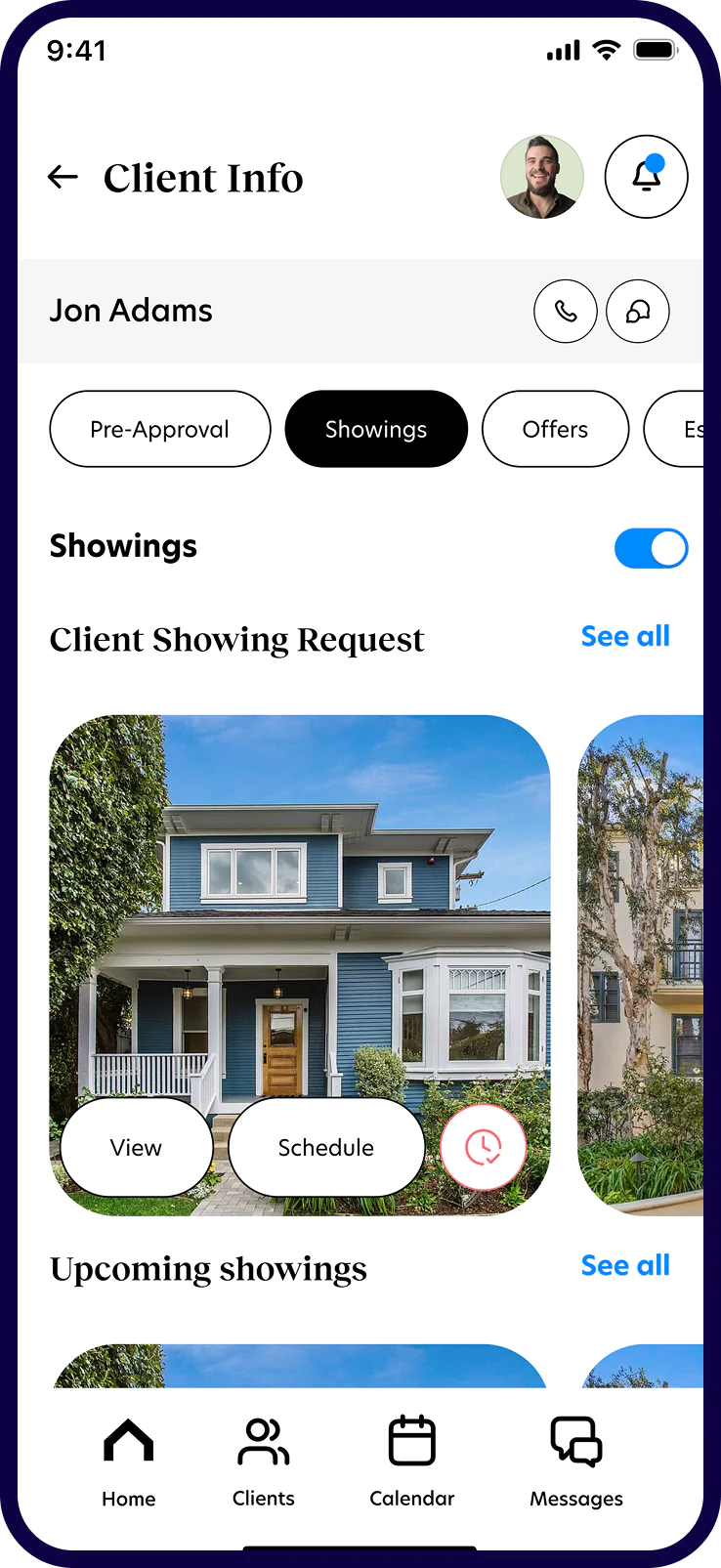
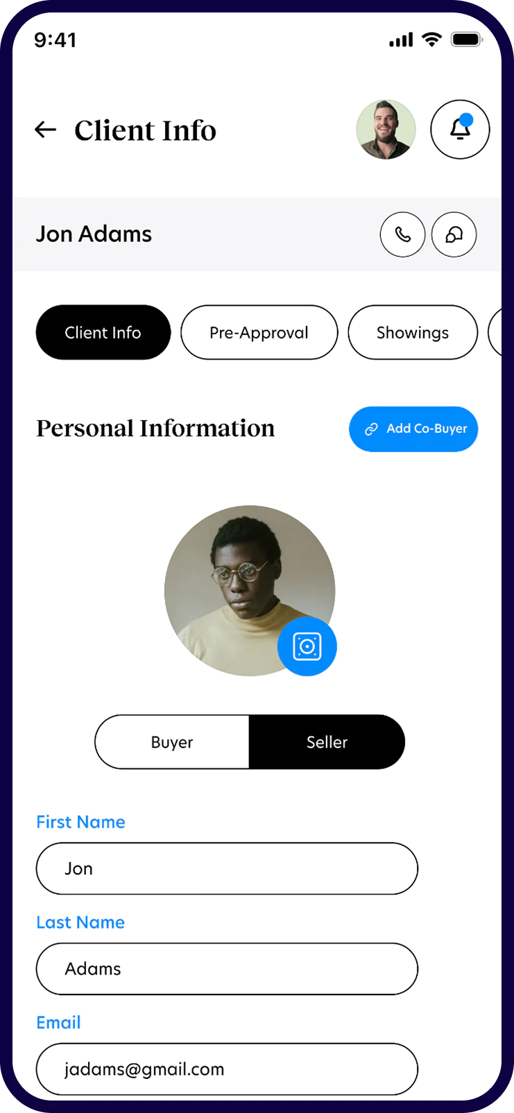
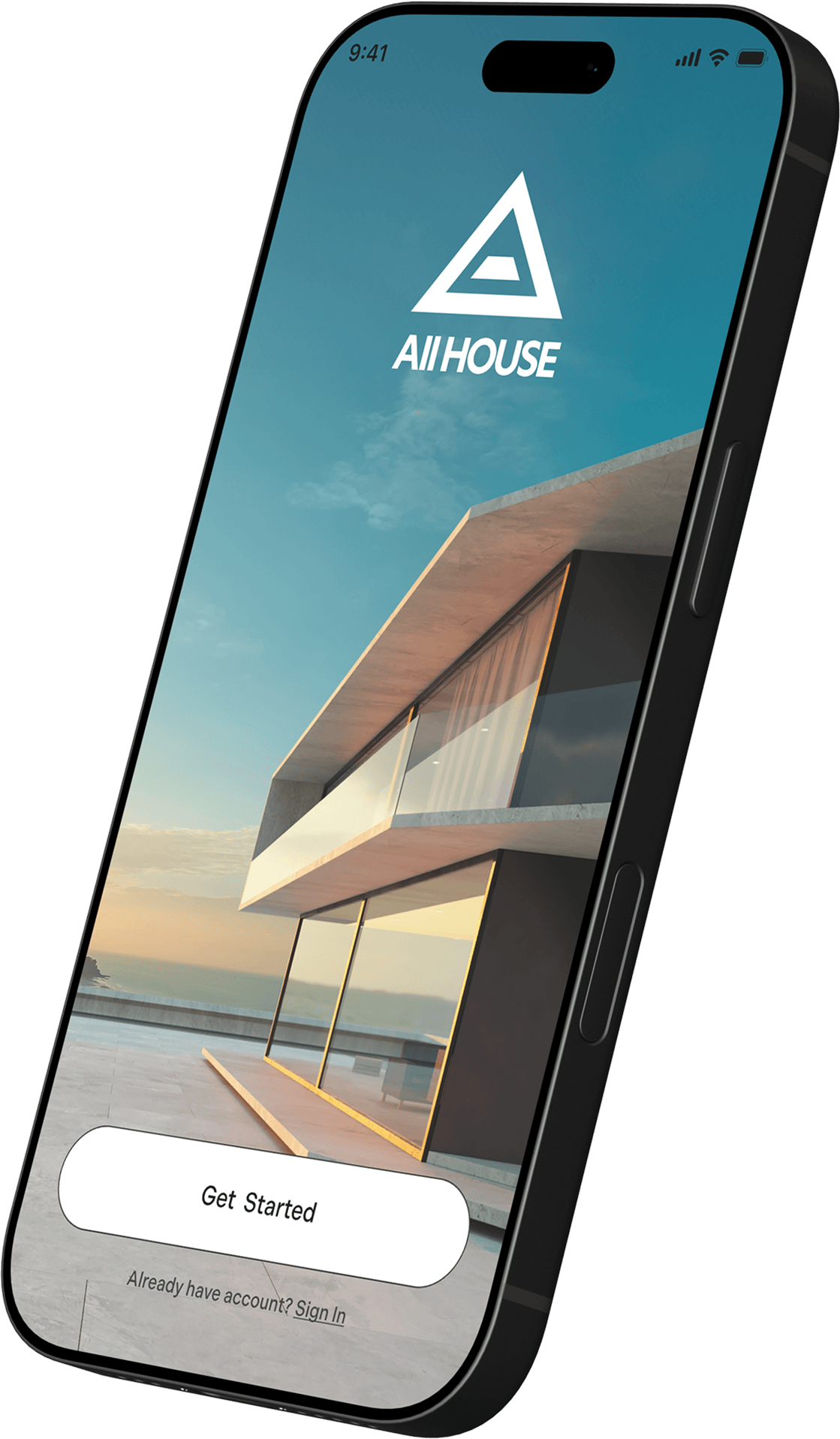
We designed All House to put the whole transaction in one place. Buyers, sellers, agents, escrow officers, loan officers and inspectors each get a view built for their job, with shared documents, messages and a calendar underneath. The brand pairs modern architectural photography with a warm serif and soft pill shapes, so a document-heavy process feels calm and human.

Introducing All House, one app that brings everyone in a home purchase together, from pre-approval to closing.

ROLE: Brand identity · UX/UI design · Design system
Client: All House
The challengeThe challenge

One purchase.Six people.A dozen channels.

01

Scattered channels

Every step runs through its own email thread, fax, phone call or vendor portal, so nothing lives in one place. So we gave every deal one shared feed of documents, messages and events.

02

No clear next step

Buyers can't see which phase they're in or what they still owe, so they keep asking their agent. So the progress bar sits at the top of every buyer screen.

03

Six roles, one deal

Buyers, sellers, agents, escrow officers, loan officers and inspectors need the same facts, each from a different angle. So onboarding asks who you are, and the home screen follows.

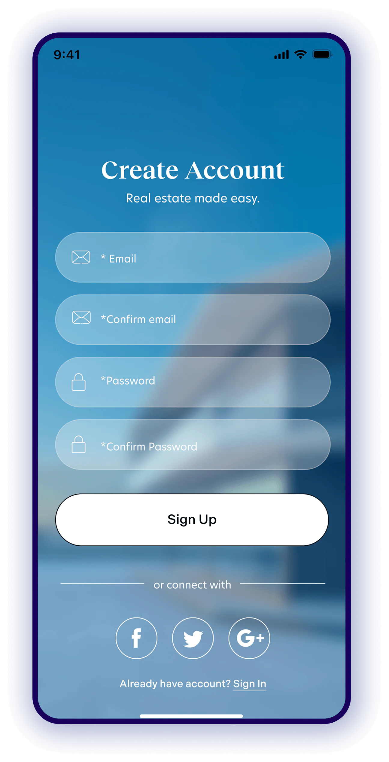
Real estate made easy.

Finding your dream home should be exciting, not overwhelming. We simplify the journey by bringing every step, document, and conversation into one seamless place. Less complexity. More possibility.

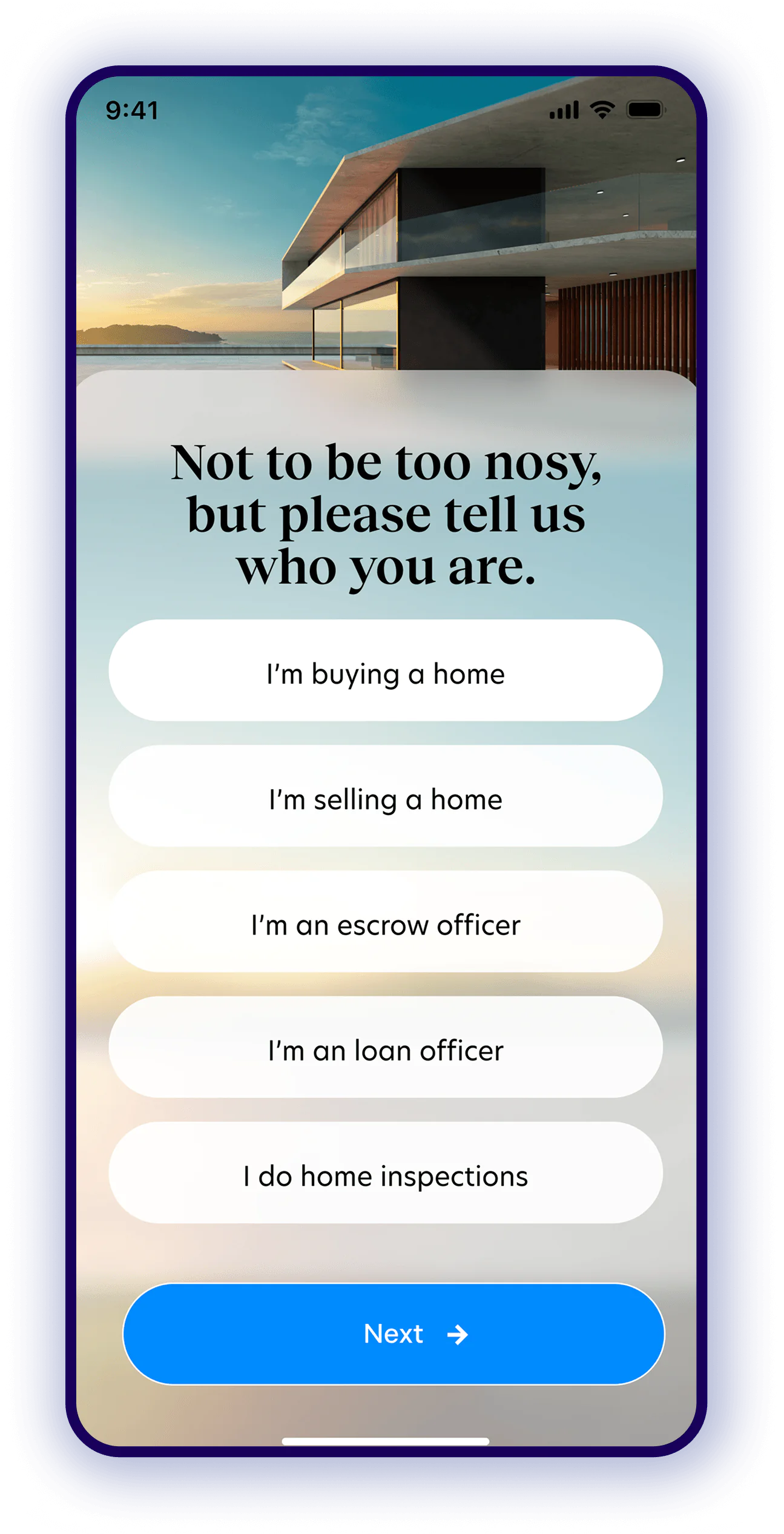
Tell us whoyou are

Onboarding starts with one friendly question: “Not to be too nosy, but please tell us who you are.” The answer decides which home screen you land on. Pick a role under the phone to see what each person gets.

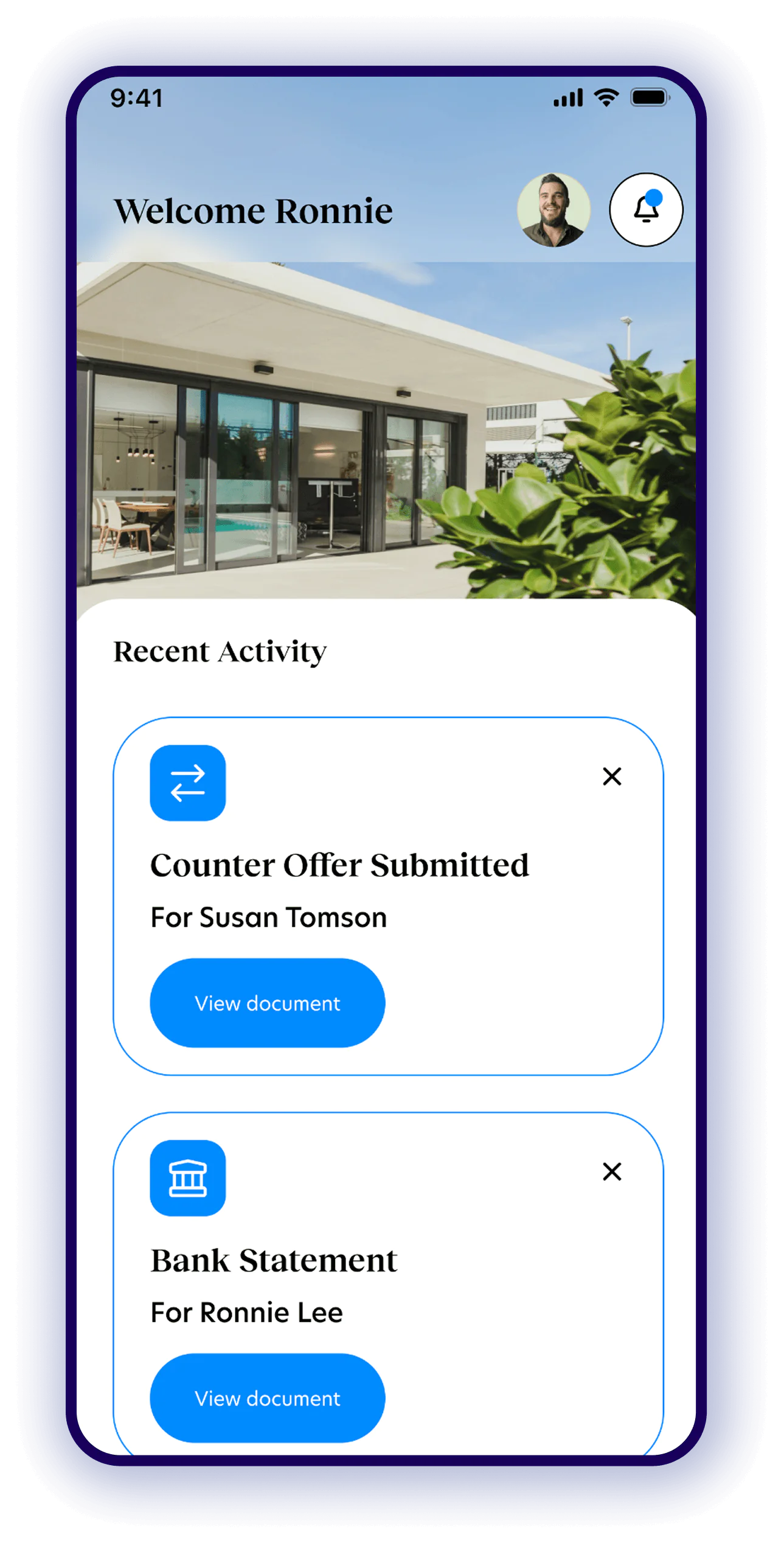
Buyer home screen

Track everydocument

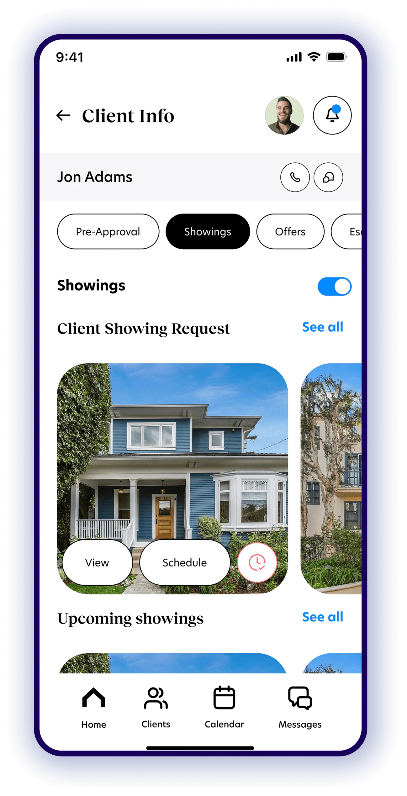
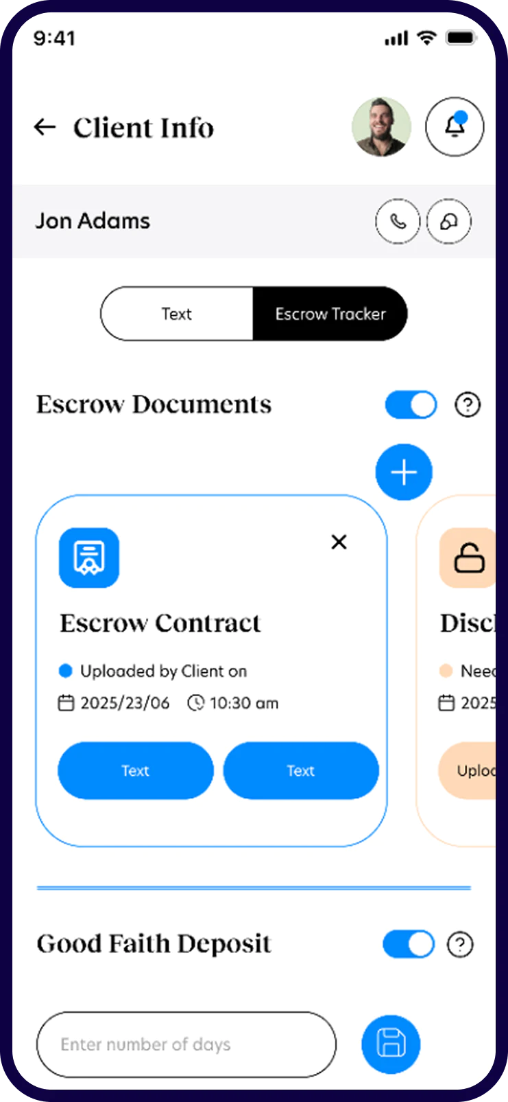
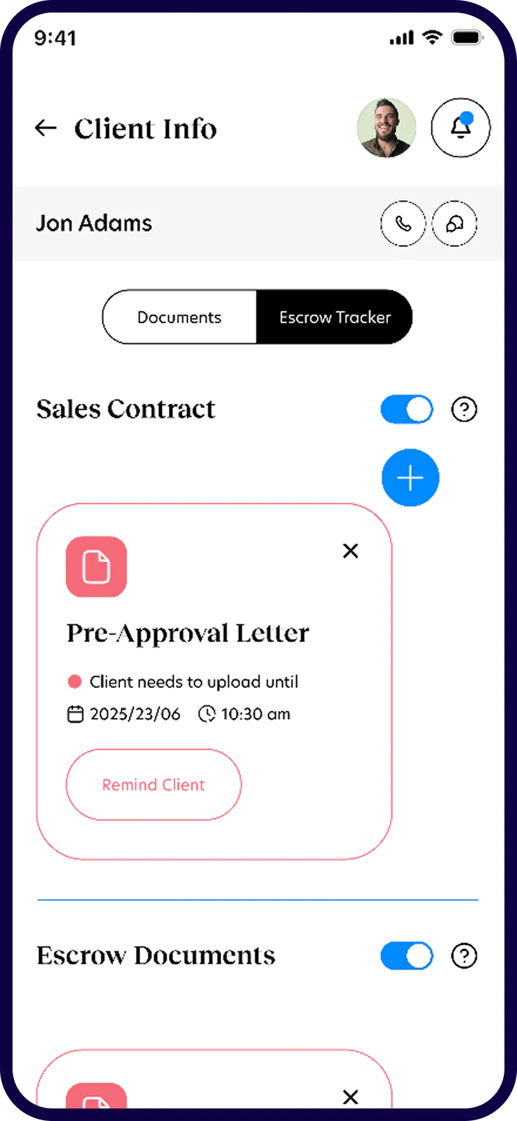
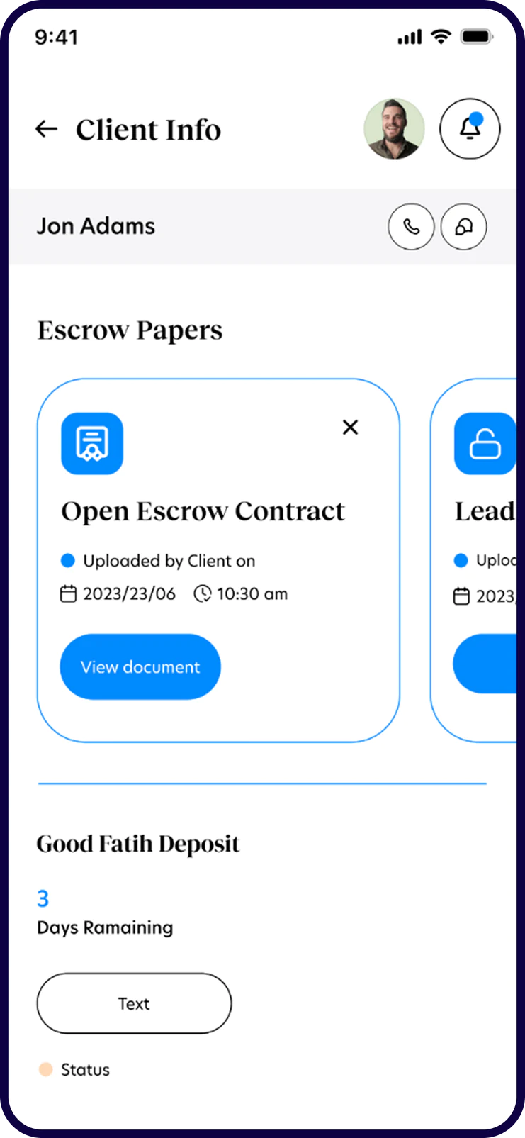
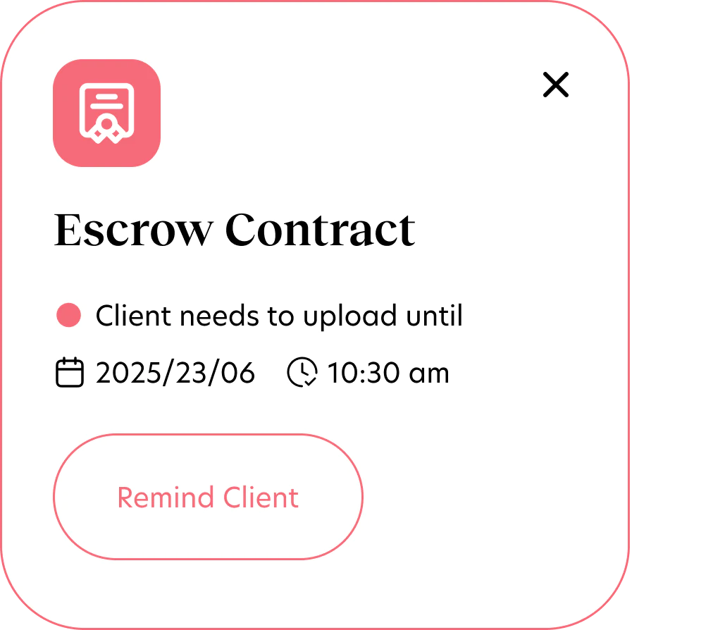
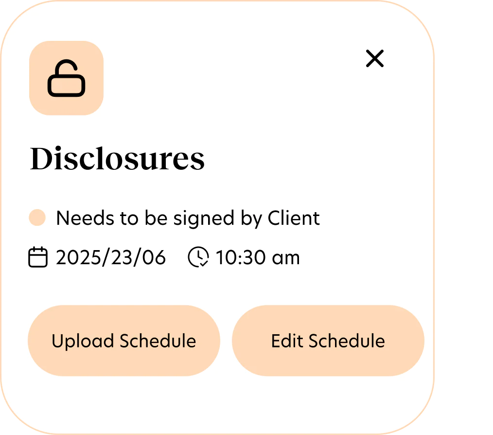
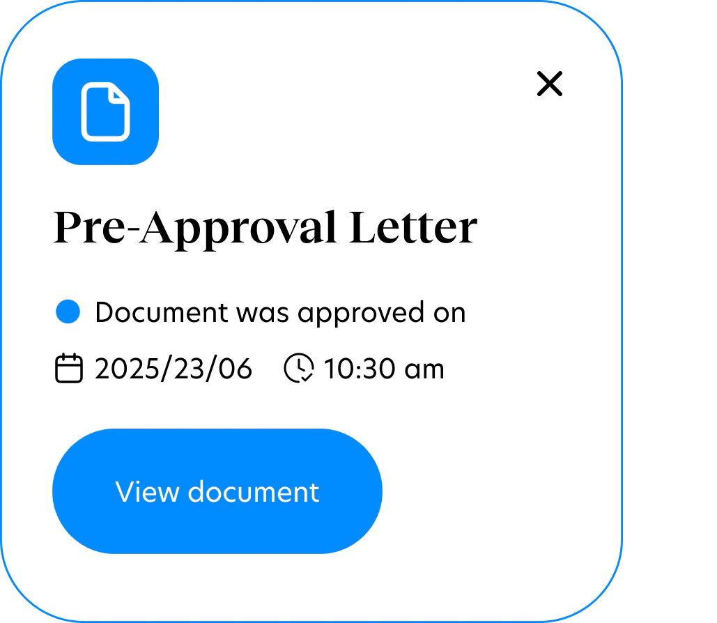
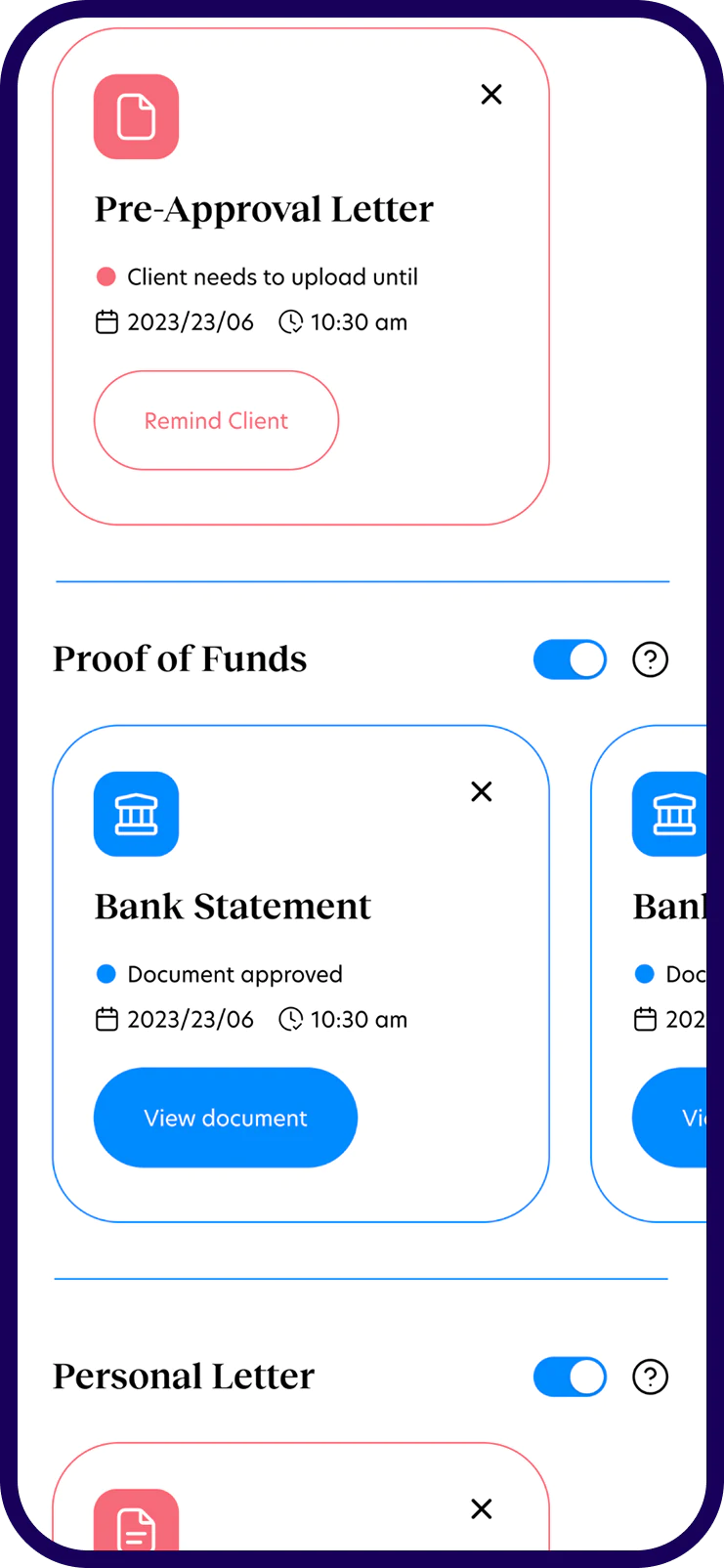
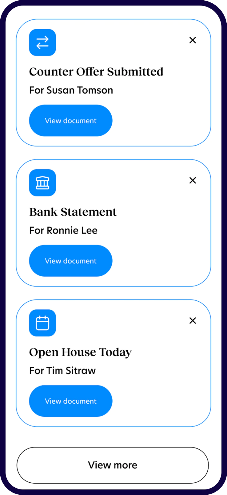
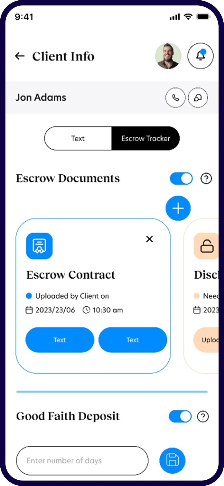
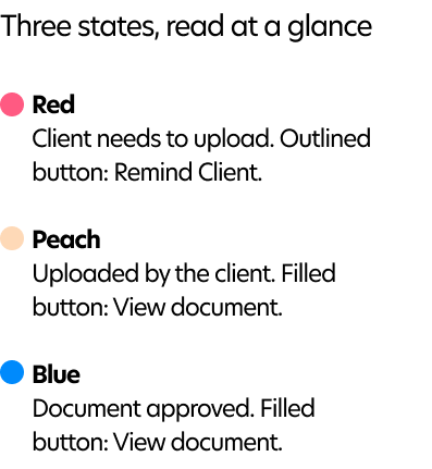
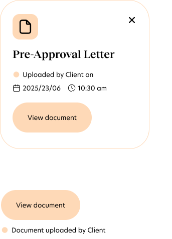
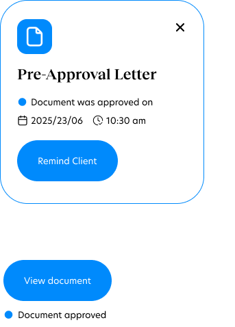
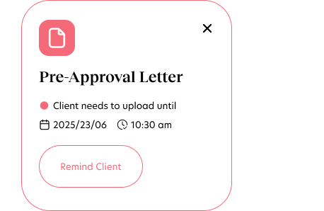
Escrow is mostly documents waiting on someone. Every document in the app uses the same card, and its color shows its status before you read a word: coral when the client still owes it, mint once it's uploaded, blue when it's approved. The button always does the obvious next thing.

Escrow tracker
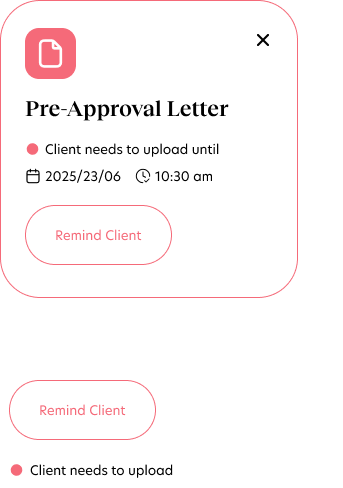
Missing document card

Chat &schedule

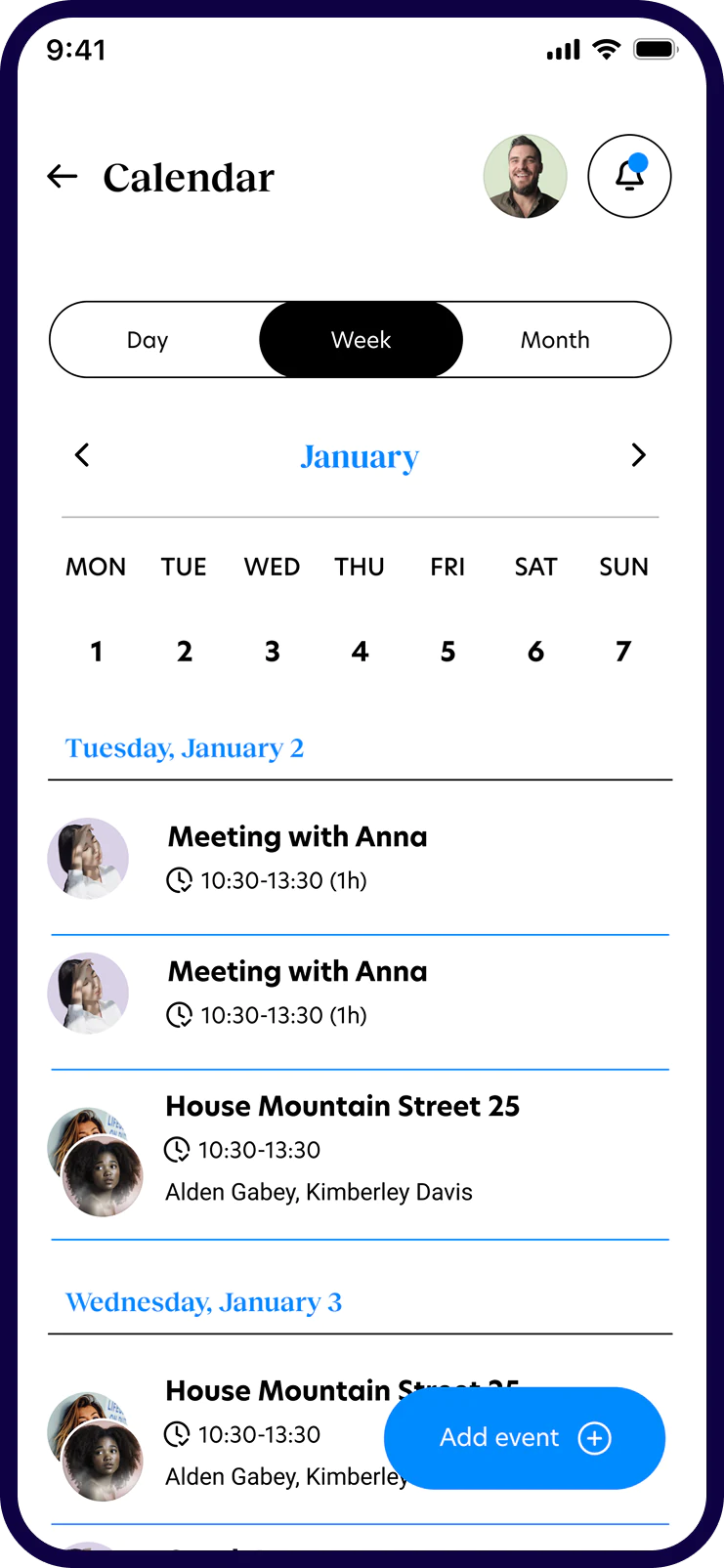
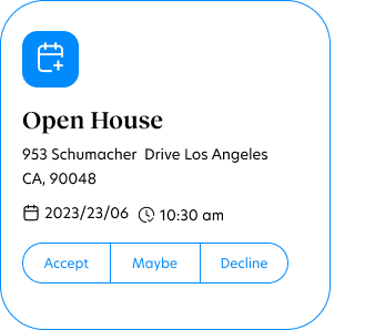
Group threads bring the client, loan officer and contractors into one conversation. An open house arrives as a card with Accept, Maybe and Decline, a missing letter can be uploaded right from the message that asked for it, and booking an appointment takes one sheet: name, date, time, people and place, saved straight to everyone's shared calendar.

Always know what's next

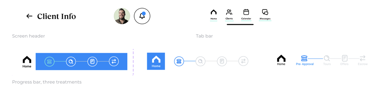
The progress bar is the backbone of the app. Pre-approval, tours, offers and escrow sit at the top of every buyer's screen, so they always know which phase they're in and what to do before moving on. Tap a stage, or watch a purchase move through all four.

Pre-approval screen
Step 1 of 4

Pre-approval

Get financing in order before the search starts.

  • Upload the pre-approval letter
  • Add proof of funds
  • Write a personal letter to the seller

Branding

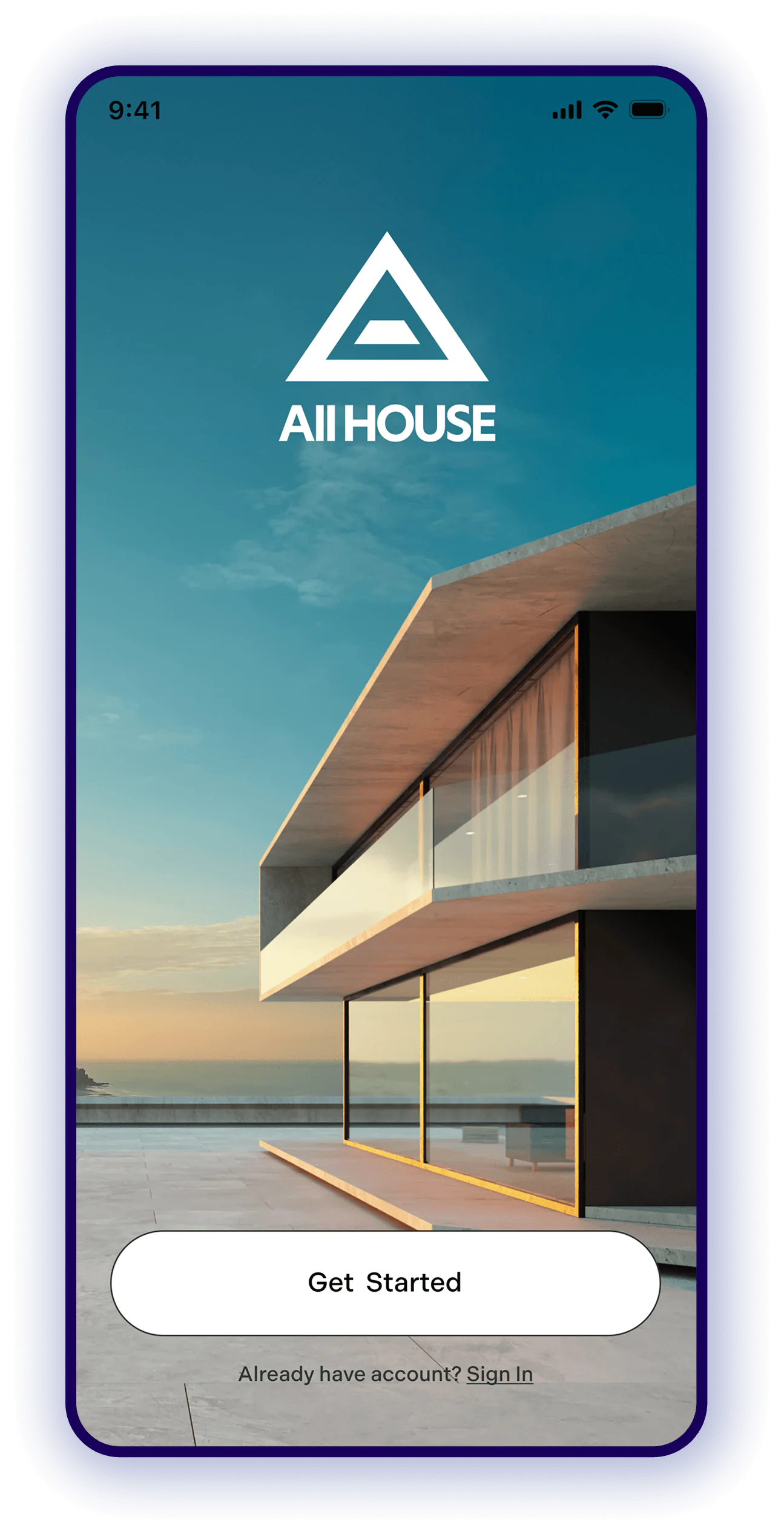
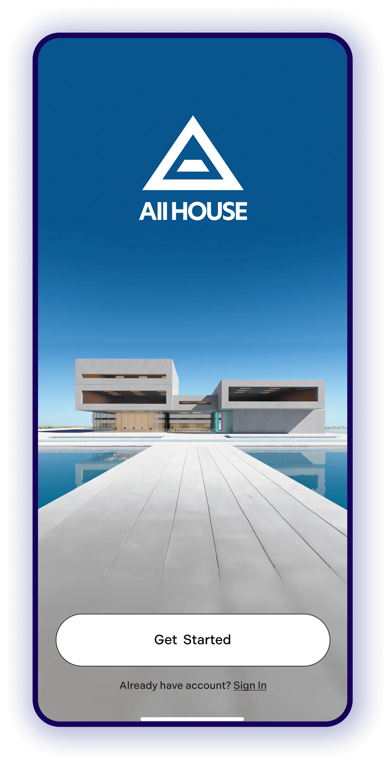
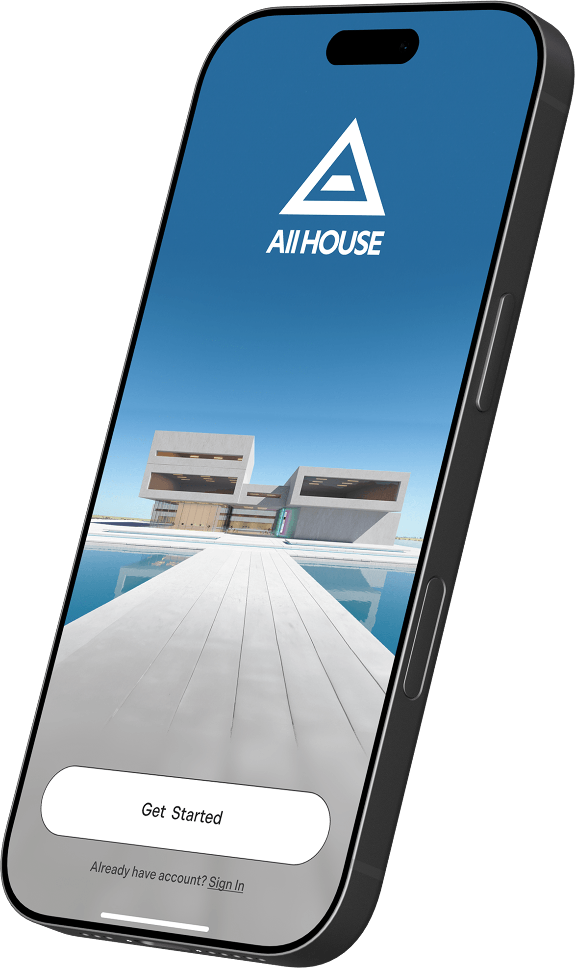
The mark is a house reduced to a triangle, with a front step at its center: a home you can walk into. It sits above a confident sans-serif wordmark and works in black or white over photography. Blue leads the palette, while mint, coral and peach do real work in the product as the status colors for documents and messages.

System

One component library serves all six roles. Everything is built from a small set of foundations, and one card pattern carries most of the product: documents, events, offers and messages.

  • Blue1
    008AFC

  • Blue2
    66EFD7

  • Red
    F56A79

  • Peach
    FED9B7

  • Grey1
    F6F6F6

  • Grey2
    A5A5A5

  • White
    FFFFFF

  • Black
    000000

Status language

Three states, read at a glance: red, peach and blue
Red card: client needs to upload, Remind Client button
Peach card: uploaded by client, View document button
Blue card: document approved, View document button

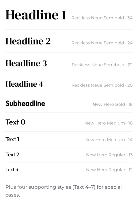
Type scale

Type scale: Reckless Neue headlines and New Hero text styles

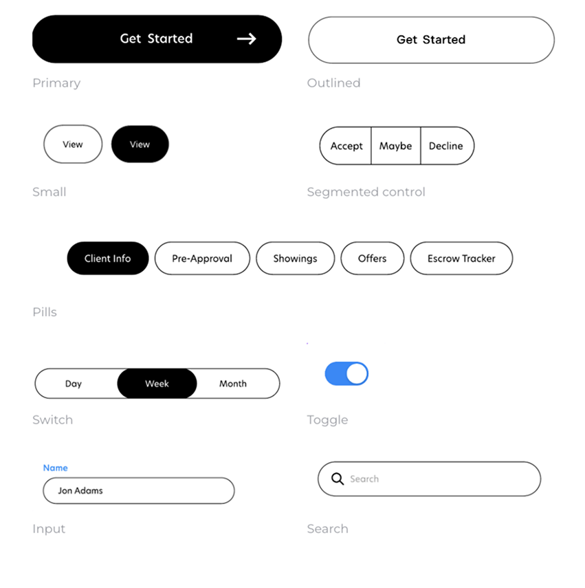
Controls

Controls: buttons, segmented controls, pills, switches and inputs

Navigation

Navigation: screen header, tab bar and progress bar

Cards & patterns

Pre-Approval section header with a toggle
Pre-Approval Letter card
Open House card with Accept, Maybe and Decline
Counter Offer Submitted card
Incoming chat message
Outgoing chat message
Document icons and content rules

Next project

Froodie

services

  • Art Direction
  • Product design & CPGs
  • Presentation design.
  • Social Campaign
  • Retouching
  • Print & Merchandise
  • Perfecting your typography
  • Branding.
  • Packaging design.
  • Storyboarding.
  • Daydreaming.